menu
close
A housekeeping brand designed to feel as good as a clean home.
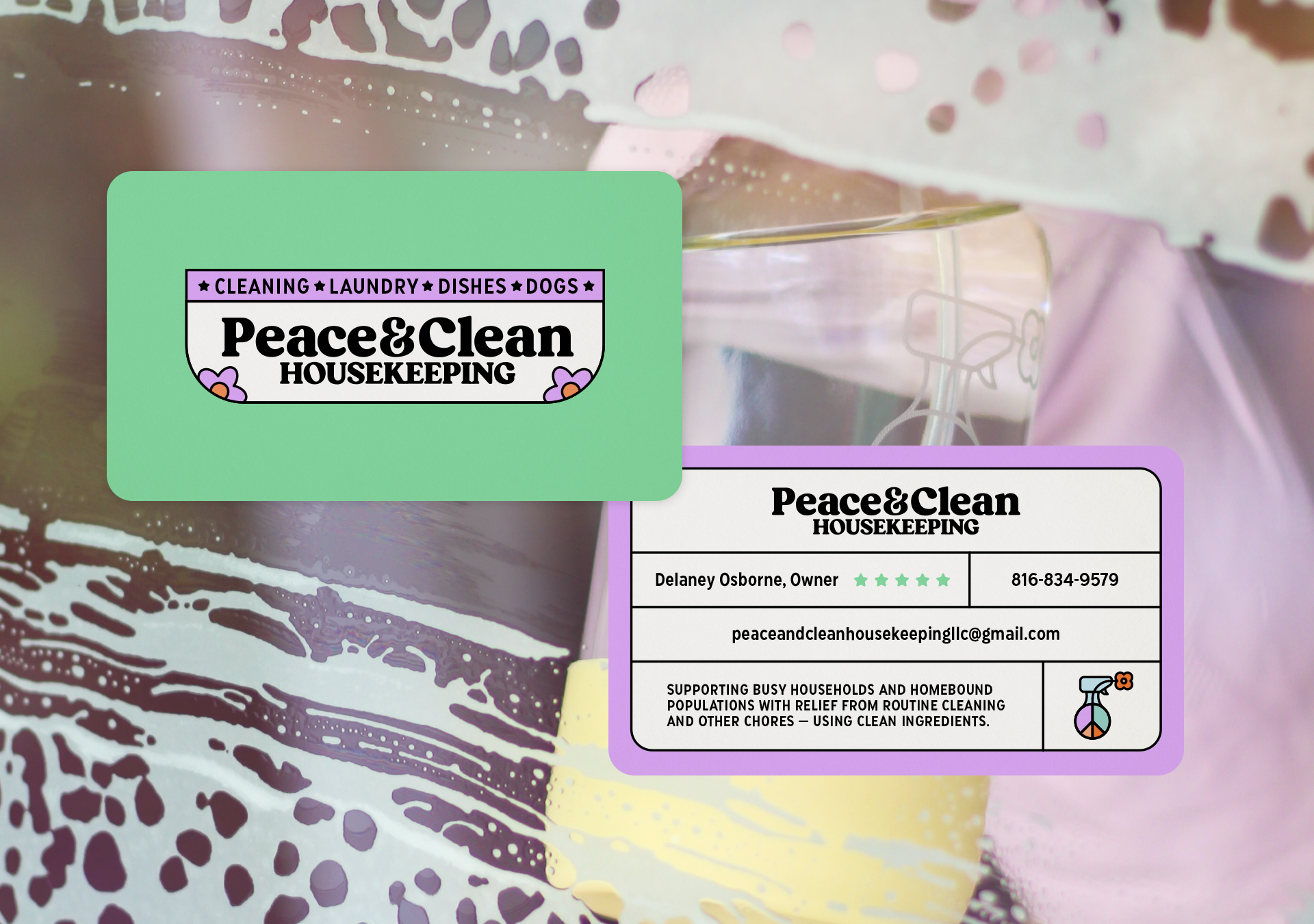
Peace & Clean Housekeeping came to us wanting to step away from the cold, clinical feeling that dominates much of the cleaning industry. There was already a natural warmth behind the business, reflecting the values of the founder, but it needed a clearer voice and distinct visual identity that could carry that feeling consistently everywhere the business showed up.
Early conversations kept circling the same idea: people are rarely searching for cleaning alone. What they’re really looking for is relief — a peaceful reset. The feeling of walking back into a space that feels lighter than it did before. Peace & Clean was positioned around the ease and calm that settles back into a home once the noise and clutter have been cleared away.
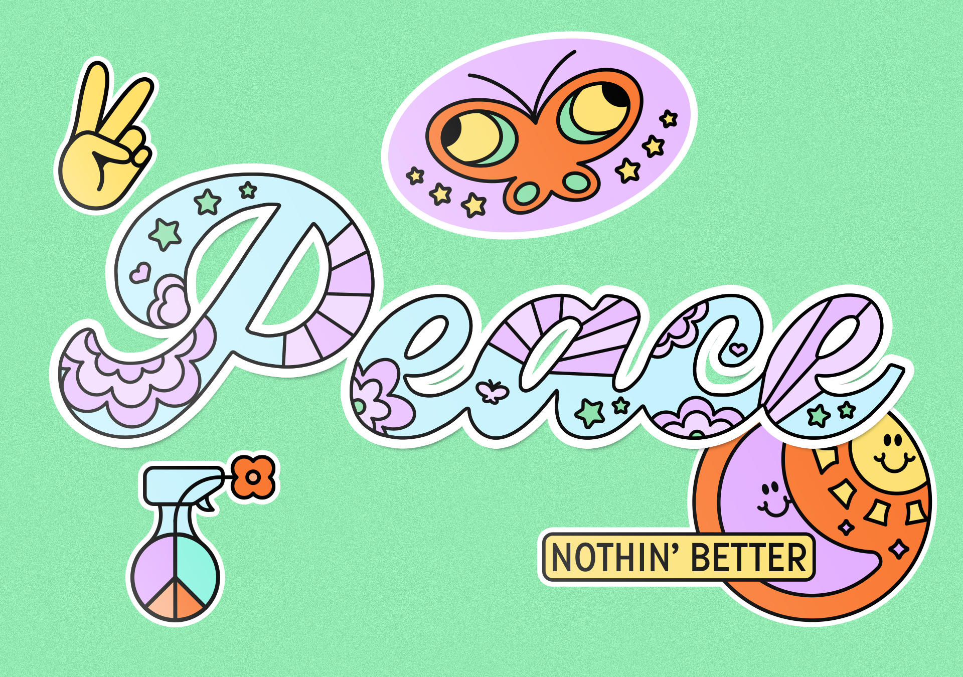
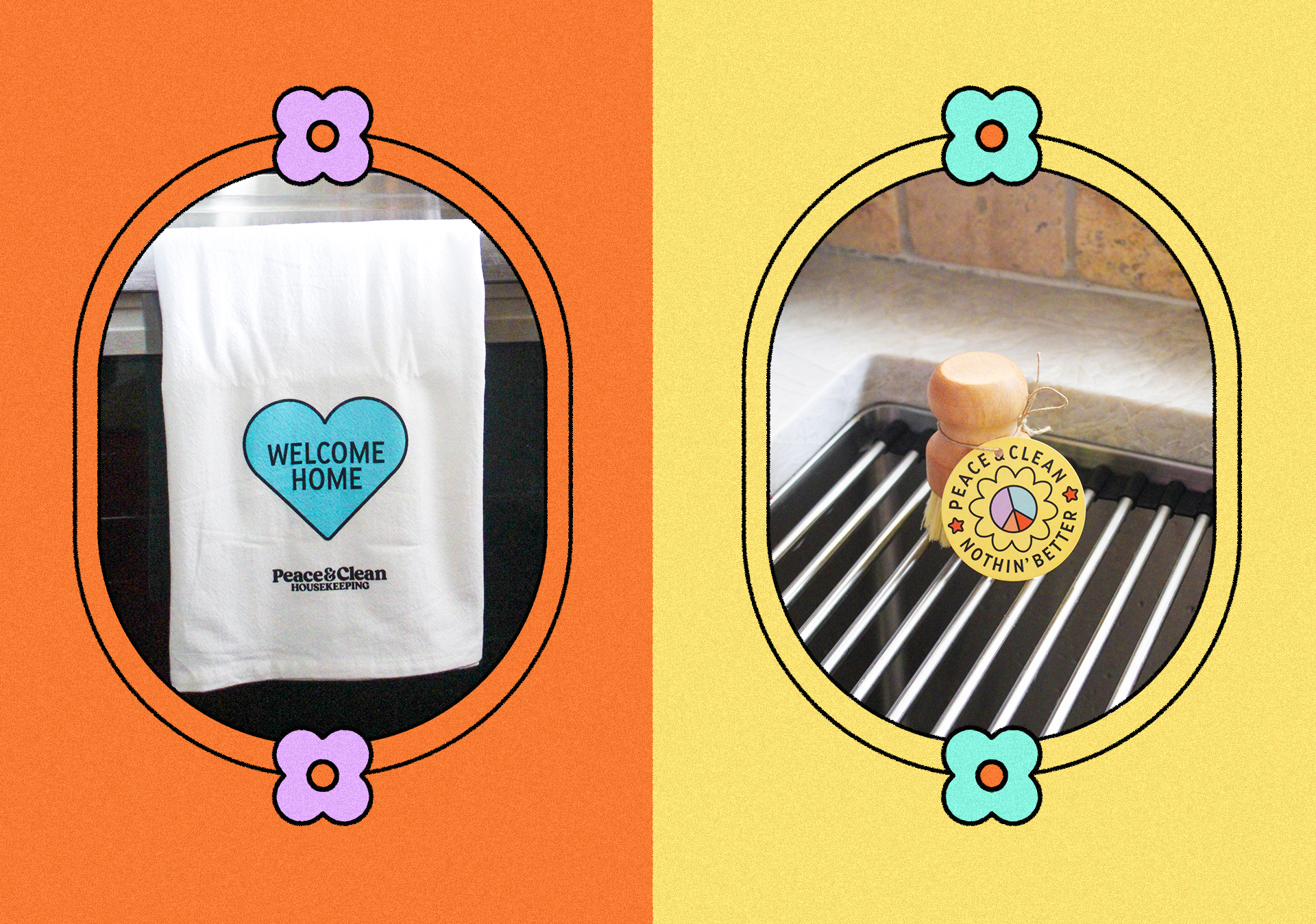
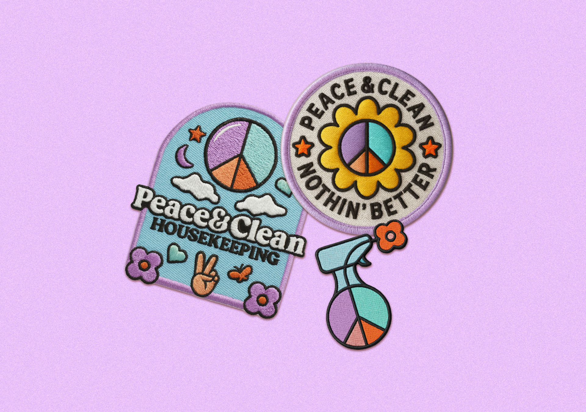
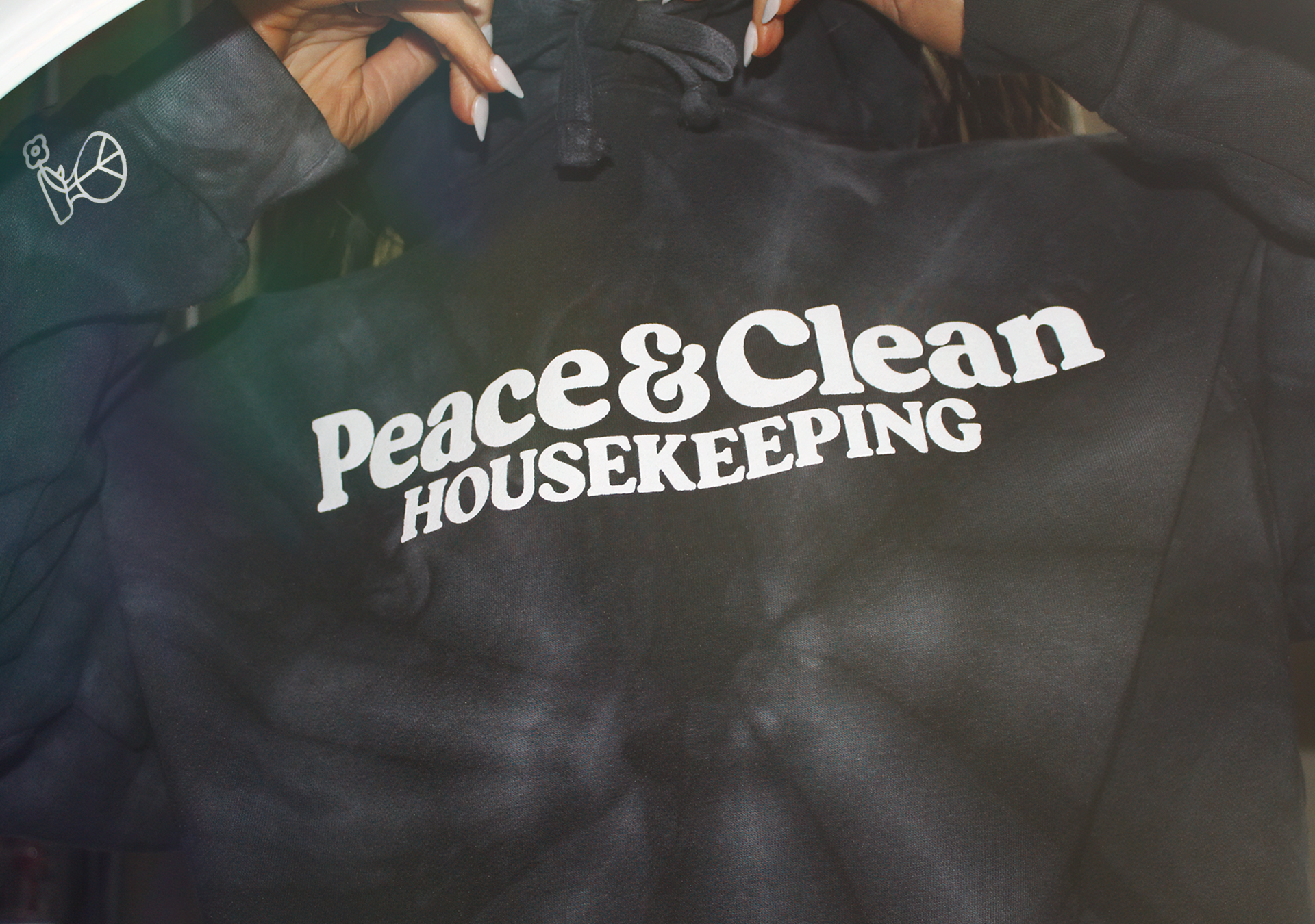
Visually, the identity pulls from retro hospitality and service brands that carried a little more personality in the way they presented themselves. Bright colors, expressive typography, and custom illustrations helped shape a system that feels approachable, memorable, and alive.