Shreddy’s Tacos
CLIENT
Brand Strategy
Brand Identity
Logo Design
Print Collateral
Digital Assets
SCOPE
Brand Identity
Logo Refresh
Website
Print Collateral
Digital Assets
CREDITS
Strategy | Jon Kankam
Design | Katie Kankam
Print Collateral
Merchandise
Digital Assets
Bringing vibrant Mexican cuisine to the mountains.
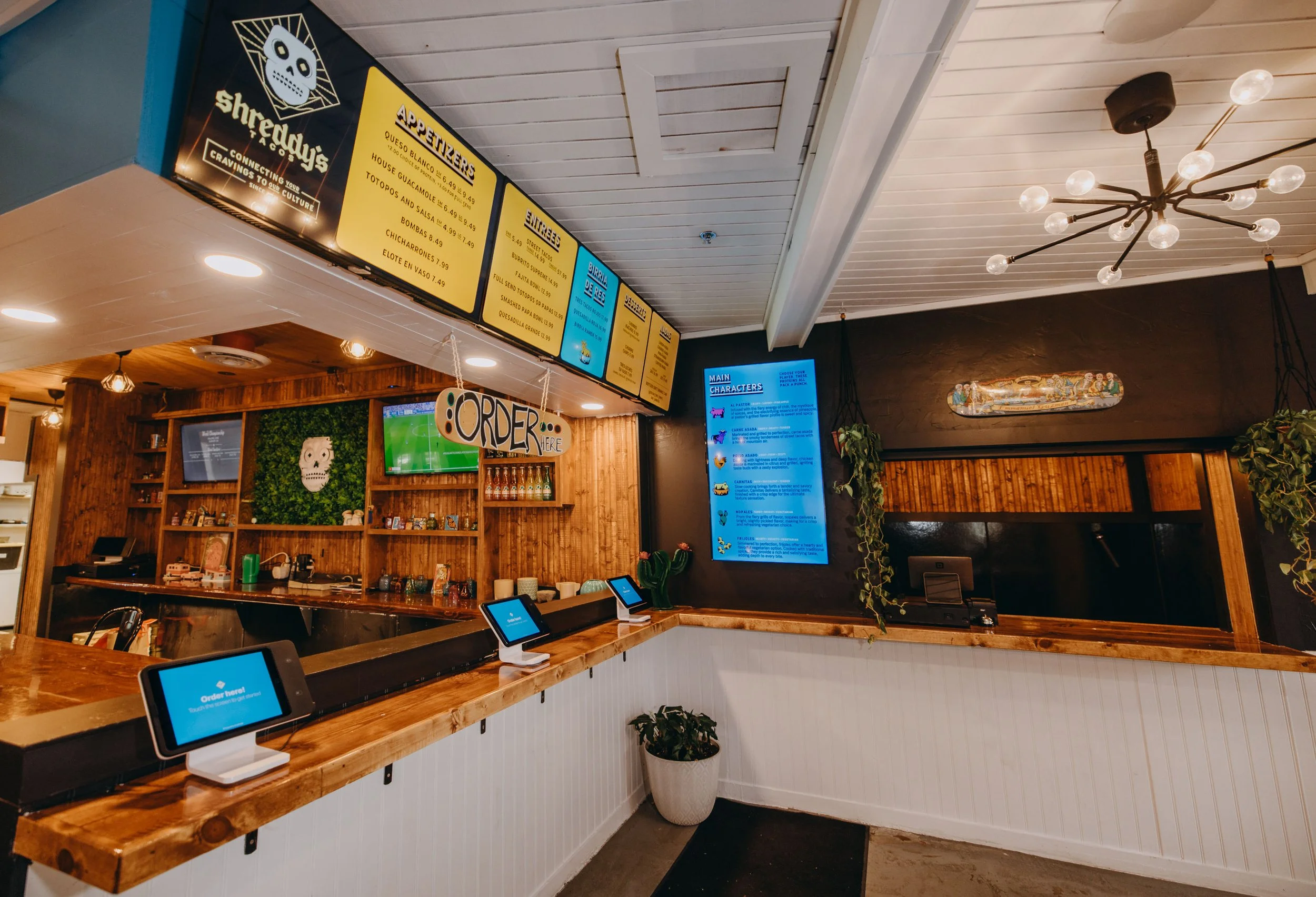
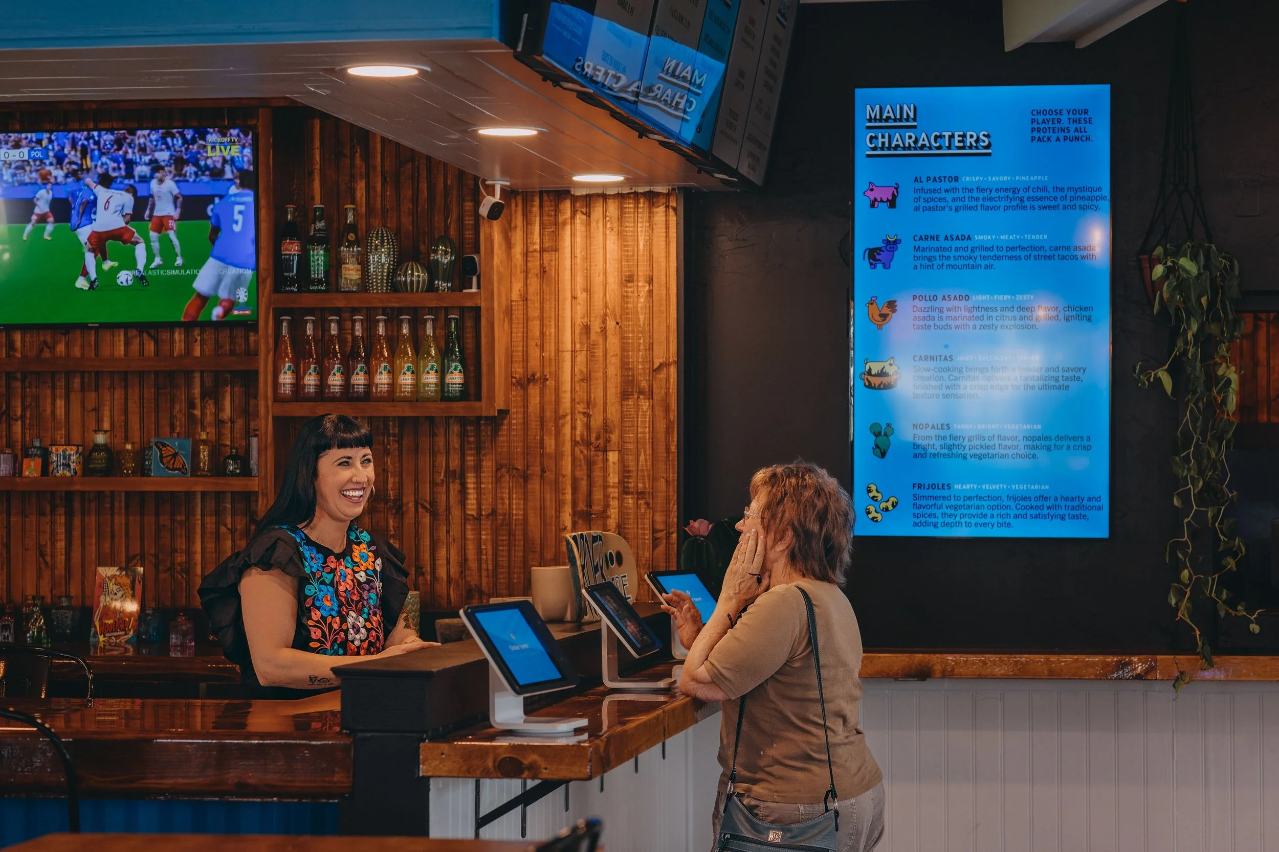
Somewhere between a powder day and a plate of tacos, Shreddy’s found its place. Born as a food truck in the mountains of Colorado, the brand had the food figured out. As they prepared to open their first brick-and-mortar, we helped shape a more scalable identity that could carry that same energy into something bigger. Less concerned with fitting in, more interested in doing its own thing.
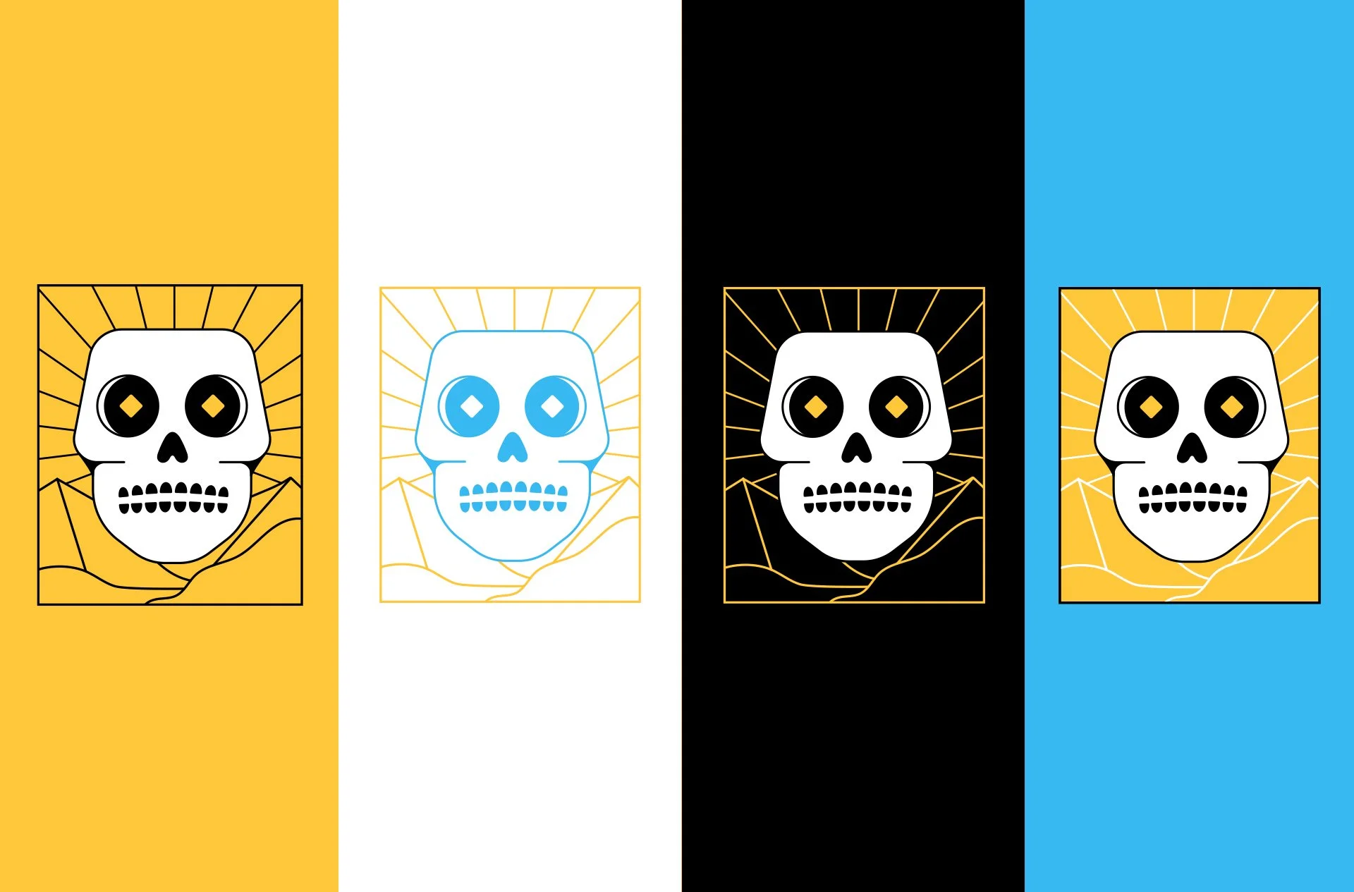
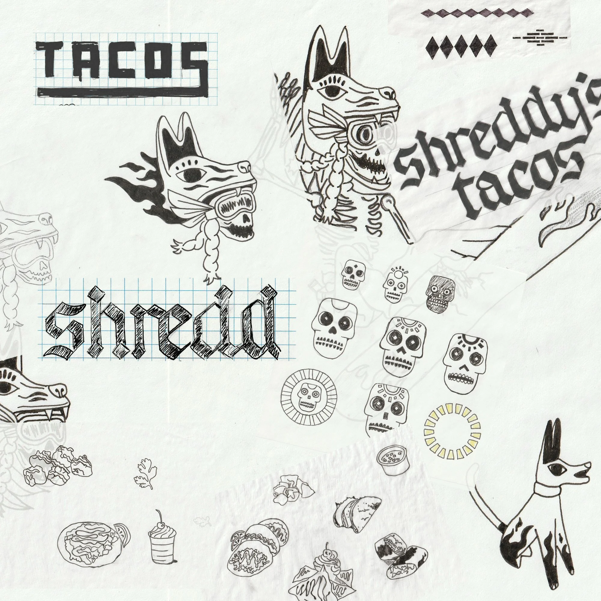
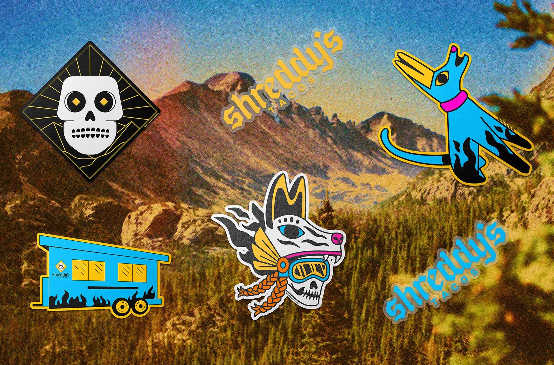
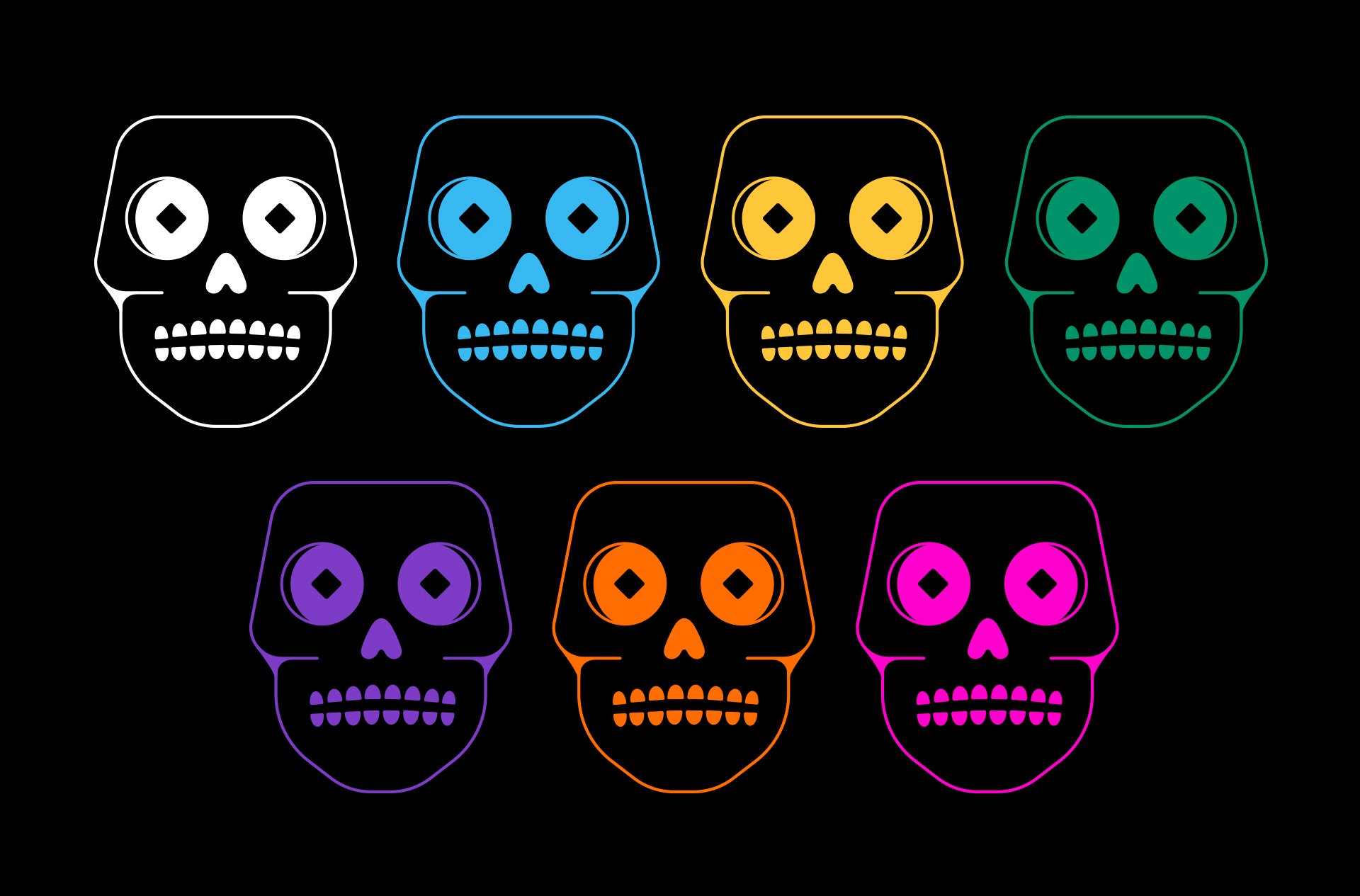
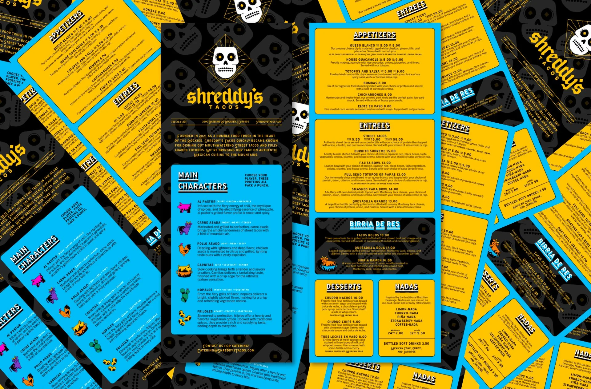
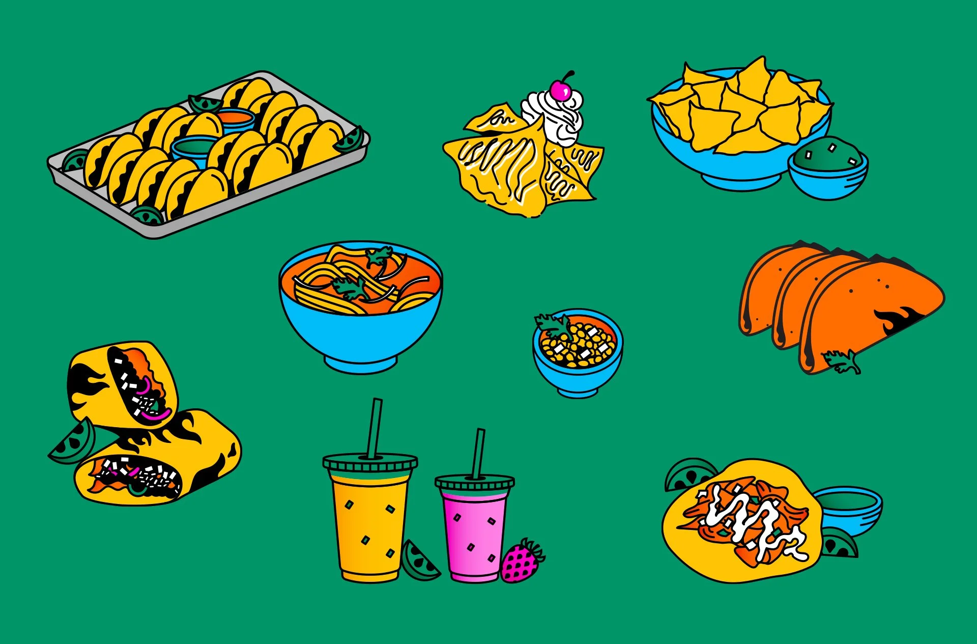
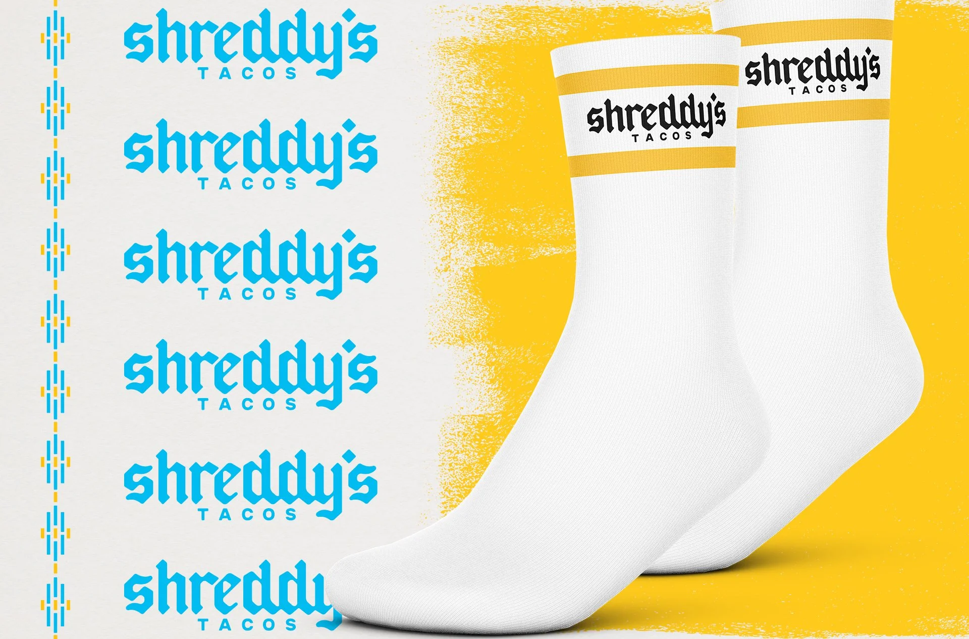
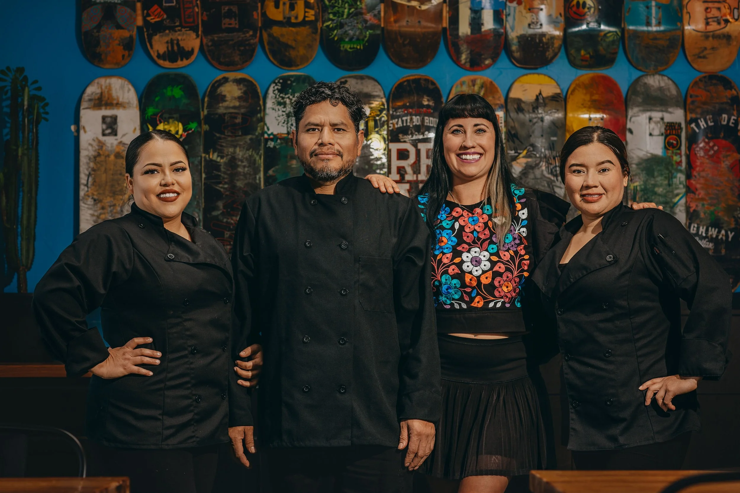
The creative direction brought about a collision of cultures: Baja heat on the Rockies’ snowy slopes. Geometric Aztec forms blend with the rough edges of mountain culture, while vibrant colors and grungy textures give the identity the feel of a sticker slapped onto a snowboard.
The result is a bit unexpected but entirely Shreddy’s. A mountain-town taqueria with a little wild in it.
Rooted in Mexico, raised in the Rockies.